Building an Outfit Around a Patterned Textile
A prominent textile can lead an outfit without overwhelming it. Learn how to balance pattern scale, color, and silhouette while letting the cloth keep its character.
A prominent textile can lead an outfit without overwhelming it. Learn how to balance pattern scale, color, and silhouette while letting the cloth keep its character.
Style · 7 min read
A patterned batik skirt is already doing plenty: its wax-resist marks draw the eye, its colors set a mood, and its shape moves with the wearer. Add a striped blouse, a bright jacket, and a busy necklace, and those details may compete rather than converse. The easiest way to build an outfit around a striking textile is to give it a clear role, then make deliberate choices about scale, color, and silhouette.
This is not a rule that patterned cloth must be paired with plain basics. It is a way to notice what the textile is already offering and decide what the rest of the outfit should add. A quiet companion can make a complex cloth feel vivid; a second pattern can create a lively combination when its scale and color are chosen with care.
Decide what the textile should lead
Start by choosing the piece that will carry the most visual weight. It might be a batik sarong, a printed jacket, a wide scarf, or a shirt made from cloth with a strong contrast between its ground and motifs. Consider where it will sit on the body and how much of its surface will be visible. A scarf wrapped close to the face behaves differently from a long skirt that occupies most of the outfit.
Look at the textile from a little distance, not only at its individual motifs. Notice whether its pattern reads as a large repeating shape, a dense field of small marks, or an irregular composition. Also note the dominant colors and the amount of open ground between motifs. These broad impressions matter more for outfit balance than trying to match every small color detail.
Then choose the supporting pieces. If the textile is the focal point, a companion garment can repeat one of its colors without copying its full pattern. A simple cotton shirt, an unpatterned knit, or a plain jacket gives the eye a place to rest. That rest is useful, not dull: it lets the textile’s surface remain legible.
Balance pattern scale without matching motifs
When two patterns share an outfit, their size and visual density help determine whether they feel related or crowded. A large, open motif may sit comfortably beside fine pinstripes because the patterns operate at different scales. Two dense prints with similarly sized marks can blur together, especially when both have sharp contrast.
Scale is not just the physical size of a motif. A small print can feel bold if its colors are high-contrast and the marks repeat closely. A larger pattern can feel quieter if its shapes are spaced apart and its colors are soft. Compare the overall impression of the cloths: do both look busy from across the room, or does one recede?
If you want to combine patterns, begin with one dominant print and one supporting print. Look for a shared color, a related shape, or a clear difference in scale. For instance, a batik skirt with broad, dark motifs might pair with a finely checked shirt in a color already present in the skirt. The check gives the outfit texture, while its smaller pattern stays secondary. If both pieces demand attention, swap one for a solid garment or add a plain layer between them.
There is no need to make every pattern combination look perfectly coordinated. A little contrast can feel personal. The useful test is whether you can still distinguish each textile’s character rather than seeing a single field of visual noise.
Borrow color with restraint
A patterned cloth may contain many colors, but an outfit does not need to repeat all of them. Pick one color that is easy to wear and use it in a nearby piece, such as a blouse, cardigan, or shoe. The repeated color creates a connection without turning the outfit into a matching set.
For a softer effect, choose a color close to the textile’s ground. A warm cream top can sit gently with a cloth whose background is ivory or unbleached cotton. For more contrast, choose a shade from a strong motif and let it appear in one companion piece. A deep blue in a print, for example, might reappear in a jacket while the remaining garments stay neutral.
Color also changes with the material and light. A glossy fabric reflects more light than matte cotton; a dark color can look especially prominent in a smooth surface. When possible, hold the companion garment beside the textile in the light where you expect to wear them. You are checking whether the colors feel related, not whether they are identical.
Accessories can provide a small echo. A leather belt, a simple bag, or understated earrings may pick up a color or texture without adding another competing focal point. If the textile already has intricate detail near the neckline, keep jewelry away from that area or choose a simpler piece.
Use silhouette to give the cloth room
Pattern is only one part of the outfit’s visual weight. Shape matters too. A voluminous printed skirt and a loose, ruffled blouse may create more fullness than you want, even if their colors work well together. A closer-fitting top can balance the skirt, while a roomy shirt may pair more easily with a straight trouser or a narrow skirt.
Think about where the textile gathers, folds, or moves. A long wrap skirt may show its pattern in shifting panels as you walk. A tailored jacket keeps the cloth’s design in a more defined frame. If the fabric is soft and draped, a structured companion—perhaps a denim jacket or a crisp cotton shirt—can add shape. If the textile is stiff or visually dense, a flowing companion may make the overall outfit feel lighter.
Proportion is personal and depends on the garment, the occasion, and how you like to move. Try the outfit while sitting, walking, and reaching for something on a shelf. A piece that looks balanced in a mirror may twist, ride up, or hide the textile’s best features once you move. Adjust a tuck, belt, or layer rather than assuming the cloth itself needs to be altered.
Keep the textile’s construction in view
Not every patterned textile is made for every garment or kind of wear. Consider its weight, drape, finish, and how it has been assembled. A lightweight cloth may feel comfortable as a scarf or loose blouse but need lining or a suitable pattern if used for a skirt. A heavier textile may work better as an overshirt or structured panel than as a gathered garment.
Respect the finished piece as well as the print. A hand-finished edge, a border, or a deliberate placement of motifs may be part of what makes a garment distinctive. Avoid hiding a border under a belt or cutting across a prominent motif with an unnecessary layer. If you are buying a finished garment, look at how the pattern meets seams and hems; those choices can affect the visual balance as much as the print itself.
Context matters, too. Some motifs and garments carry local, ceremonial, or community meaning beyond their decorative effect. If the textile’s background is unfamiliar, ask the maker or seller about its use and interpretation rather than treating a pattern as interchangeable decoration. Wearing a cloth thoughtfully includes being curious about what it means and how it is meant to be worn.
A hypothetical worked example with a batik skirt
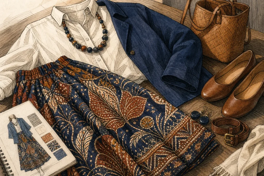
Imagine starting with a full batik skirt in dark indigo and warm rust, with broad motifs and a visible border near the hem. The wearer wants to keep the border visible, needs to walk comfortably, and prefers not to add another strong print. They choose a plain, softly structured cream cotton shirt and tuck it in lightly at the front, leaving enough room to move. A simple indigo belt echoes the skirt’s ground, while low-profile shoes keep attention on the cloth.
The expected result is an outfit with one clear focal point: the skirt’s broad pattern. The cream shirt creates visual breathing space, the belt links the pieces without repeating the motifs, and the skirt’s shape remains easy to move in. If the shirt feels too stark, the wearer could try a muted rust-colored layer instead. The tradeoff is that a colored layer may make the outfit feel more coordinated but could draw attention away from the skirt’s border.
Make a final edit before leaving
Once the outfit is on, step back and notice where your eye lands first. If it jumps between the textile, a bright accessory, and a second print, remove or simplify one element. If the whole outfit feels flat, add a single thoughtful contrast: a different texture, a defined belt, or a companion color from the cloth.
Check that the garment sits comfortably and that the textile’s important details remain visible as you move. The aim is not to quiet a patterned cloth or make every piece match. It is to give the cloth enough space to speak, while the rest of the outfit makes wearing it feel natural and considered.
Related reading
How Place Shapes a Textile Tradition
Learn to read a cloth through the materials, weather, work, and local habits around it, without…
Storing Folded Fabric to Reduce Wear
A shelf, drawer, or storage box can each suit folded fabric. Choose by checking the textile,…